The myki website has been a work in progress since the very beginning. It's gone through several iterations, and to the credit of myki, Kamco and the TTA (Transport Ticketing Authority) there have been improvements in the three years since myki started in Melbourne. But there's still a lot of niggly little problems which should have been fixed ages ago, and other problems which have surfaced over time.
1. Transactions don't always appear in the right order. A default fare touch off will quite often appear AFTER it's corresponding touch on, even though logically it occurred prior. (Also: when myki began, these would appear as "Auto Touch Off"; which In my opinion is a much better description for them).
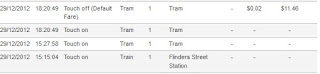
2. Sometimes transactions appear twice. Again, most often default fares. Here's a particularly bad example. Mostly the duplicates vanish later on.

3. When you do a change of mind, the touch off doesn't show. A change of mind is when you touch on and off at the same Railway station (you can't do it on Trams or Buses) within 15 minutes, and you aren't charged. Back at the very beginning of myki, it would actually show as a "change of mind" in the transaction list (which was very helpful), but these days you just get the touch ons and the touch offs vanish into the ether, which doesn't help when it comes to deciphering your travel history.

4. Contradictory Online Top-up information. When you do an online top-up, you are told several times that it can take at least/up to 24 hours to complete. But on the "Manage Cards" screen, you are told that your online top-up will load to your card the next time you touch your card to a reader, with no mention of a possible delay.

5. Cancelled/Blocked Cards can not be easily removed. If you have to replace your myki due to damage/loss/theft etc, the old card stays visible on the website. Many people don't realise you can request to have them "archived" so they no longer appear, but it would be much better if you could choose to hide it yourself or delete it completely if no longer required.
6. Site not rendering correctly in different browsers. The myki website works fine in Internet Explorer, the only problem is that IE is no longer the most popular Browser on the internet. At this point in time, the mymyki site is rendering weirdly in Firefox and Google Chrome, the two most popular browsers.
7. Applying for a myki online is confusing and non-user friendly. I like to think I can find my way around a website pretty easily, but three years ago when I ordered a myki online I found the process confusing and non-intuitive. It would appear little has changed. The screen where you enter your details when applying for a myki is badly designed, and daunting to even the most seasoned web user. It badly needs updating.

8. Inconsistent information flow. The updating of trip history on the myki website has had a chequered history indeed. When it first started, some transactions were showing up on the same day, though this didn't last. Then they were (mostly) showing at 7AM the next day. Over time this has gotten later and later, and in some cases we have gaps of several days where no history was updating, or in some cases our entire web history vanishes without explanation and then returns. I sense this is a symptom of a systemic flaw with the fundamental design of myki, and won't be remedied any time soon.
9. Your username must be eight characters long. I found this one particularly annoying. Most of my online logins are a mixture of 6 or 7 characters long, but having to come up with 8 seemed frankly a bit silly. 6 would be better.
10. myki pass online top-ups don't show when waiting to load. When you top-up with myki money online, it shows up as waiting to load onto your card on the website. But not so with the more expensive myki pass. Although you get a nice email, there is no sign on the website that your top-up is waiting, and you won't know for sure that the request was successful until you touch your card to a reader or machine usually the next day.
There are probably other issues that I haven't through of. The main myki information site has lots of helpful stuff and is mostly user friendly. But the "mymyki" backend could definitely use with a spruce up and a re-design to make it easier to navigate. Hopefully as things move forward many of these issues will disappear.
The main myki login page (http://www.myki.com.au/Manage-my-myki/Account-log-in/Account-log-in)(before the popup launches - why?!) also has a nice big graphic "MANAGE", not to mention the less obvious "login"... neither of which do anything - they're just pictures when they could so easily be links.
ReplyDeleteThe actual login is in the top right corner.
Usability fail.
What about missing transactions? Still waiting for a bus to download data. A bank statement would show "travel - pending details", so at least the arithmetic of the staement would be correct.
ReplyDeleteAlso, why not borrow from the Banks the Account Nickname... any nickname given to a myki would stop topping-up the wrong-un.